
INTRODUCING OUR NEW LOOK
Since 2015, Change Please has been fighting homelessness by selling award-winning, great tasting coffee.
100% of our profits, goes into giving people experiencing homelessness, a living wage job, housing, training, onwards opportunities — and a fresh shot at a life.
SO WHY THE CHANGE?
We are so grateful for all the supporters we have around the world, and we felt it was time to inspire more people to join us to fight homelessness.
Particularly, as the situation continues to worsen with the cost-of-living crisis. There are more and more people in desperate need, in all our communities, and we have a lot more work to do still.
So, we wanted to evolve our branding to help us standout more amongst all the other coffee brands out there. It was important for us to show to our supporters that they don’t have to compromise between quality, having a great experience and doing good. Change Please believes you shouldn’t have to sacrifice taste to help give back.
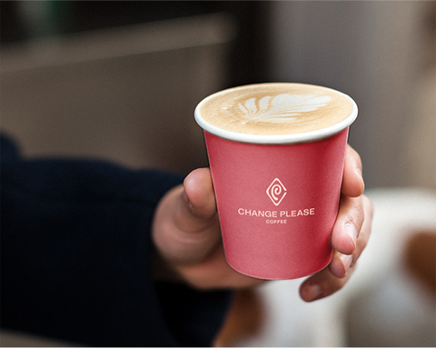
WHAT ARE THE CHANGES YOU WILL SEE?

Our elevated and timeless logo matches the great quality of our coffee, which has won multiple awards, including eight highly coveted ‘Great Taste Awards’.
THE PLEASE is as bold as the CHANGE to convey confidence and urgency…the homelessness crisis is getting worse, so we need action now. The PLEASE is not a question, it is a demand.
We also wanted to include more storytelling in our brand, with an icon that would become a universal symbol recognised globally, rally everyone together to fight the fight – and help our coffee drinkers discover and learn more about homelessness.
Did you know there was an entire ‘secret’ language of symbols that have been used over hundreds of years between people battling homelessness to help one another out?
They would leave these symbols chalked or carved outside of buildings to tell others who might follow their similar paths; which places they should visit for food, work or other help that can get them through the day - or even bad people or areas to avoid.

Incredible.
The symbols show that we are talking about real people, with real serious challenges and, more importantly, that they were having to look out for each other as that is all they had. There were even signs to give motivation for those who were struggling… one for telling others to ‘never give up and to persevere’ or the ‘sky’s the limit’.
So, we found two symbols that were a perfect fit for what we did at Change Please. One is ‘a good place for a job’ as we are all about solving this crisis through an employment first model. Secondly, the other sign is ‘hard work pays off’.
We love this because…yes, we provide employment opportunities, but without the courage, hard work, hustle, and dedication that our barista trainees show… there would be no success stories.
Also, if you look carefully - we tweaked the symbols slightly so they could also stand for our initials… you might see the C for Change and P for Please!

Our new colours represent the energy, optimism and warmth we want to portray as a brand. We are about positive change and empowerment.

WHEN WILL YOU SEE IT?
You will start seeing our new brand look appearing in our cafes, on our websites and social channels to begin with.
As all our profits go towards fighting homelessness, everything takes a bit of time and focus. so we expect a slightly longer transition to the new brand identity.
So please bear with us as you may see a mix of our old and new branding in different places.
We hope you love our change as much as we do!
Thank you from the Change Please Team.